App Studio Application


App Studio is Quarks digital publishing solution. It allows clients to turn print publications into interactive digital editions for both iOS and Android

In 2014 the decision was made to redesign the App Studio application across both operating systems. The business realised that the existing app design was limited to glossy, richly designed magazines, however a demand from text heavy publications such as journals, periodicals and reports was on the rise and it quickly became evident that the current solution was not adaptable to this type of content.

 
Screen Shot 2019-10-23 at 8.32.25 pm.png
Grey 3.png
 

My role

My role was to lead the design team responsible for the re-design. This involved working across the UX, UI, presenting to business stakeholders (including clients) and collaborating with development teams to achieve the desired outcome.

The problem

As our client base increased, so did the types of publications we needed to provide for. This meant that we needed an adaptable application that allowed for the differing content types and purchasing models our clients provided. Alongside this, clients were asking for a branded mobile experience, yet the majority didn’t want to pay to build a custom application. Customising the base app per publication would eat up too much valuable design and development time and was not a sustainable strategy to move forward with.

The approach

The approach was to build a generic one size fits all solution which would take into consideration the key requirements of each publication type. These being purchasing models, branding, navigation, and feature sets.

 
Screen Shot 2019-10-23 at 8.34.13 pm.png
 

Research

The team started by uncovering current usability issues within the existing product through usability testing with a range of new and existing users. We reviewed competitor products, ran stakeholder interviews with our clients to help identify key features, and explored customer reviews within both the App Store and Google’s Play Store to capturing major frustrations.


Screen Shot 2019-10-23 at 8.47.13 pm.png
 
IMG_4987.png
blue 5.png
 

A Tough Design Challenge

We had a huge variety of requirements to design for. A daily publication may wish to show the last 7 issues, all equally promoted. Whereas a quarterly publication may need to heavily promote the latest issue. Some publications offered a range of subscriptions, whereas others didn't offer any.

There were also differing requirements around the way content was consumed. From navigating quickly to the back of a newspaper to see the sport section to locating a specific article of interest in a content heavy journal.

 
iPhone2.jpg


Wire-framing

We mapped out the desired flow for the app, covering all detailed requirements. This was quite a lengthy process that involved continued testing, stakeholder meetings and iterating. iOS was our largest user base so we focused here first with the plan to tackle Android after. However it was still key to keep in mind how each part of the design would work across each operating system.

 
Iteration-v4-Full-wireframe-(for-CS6).png
 

The Design

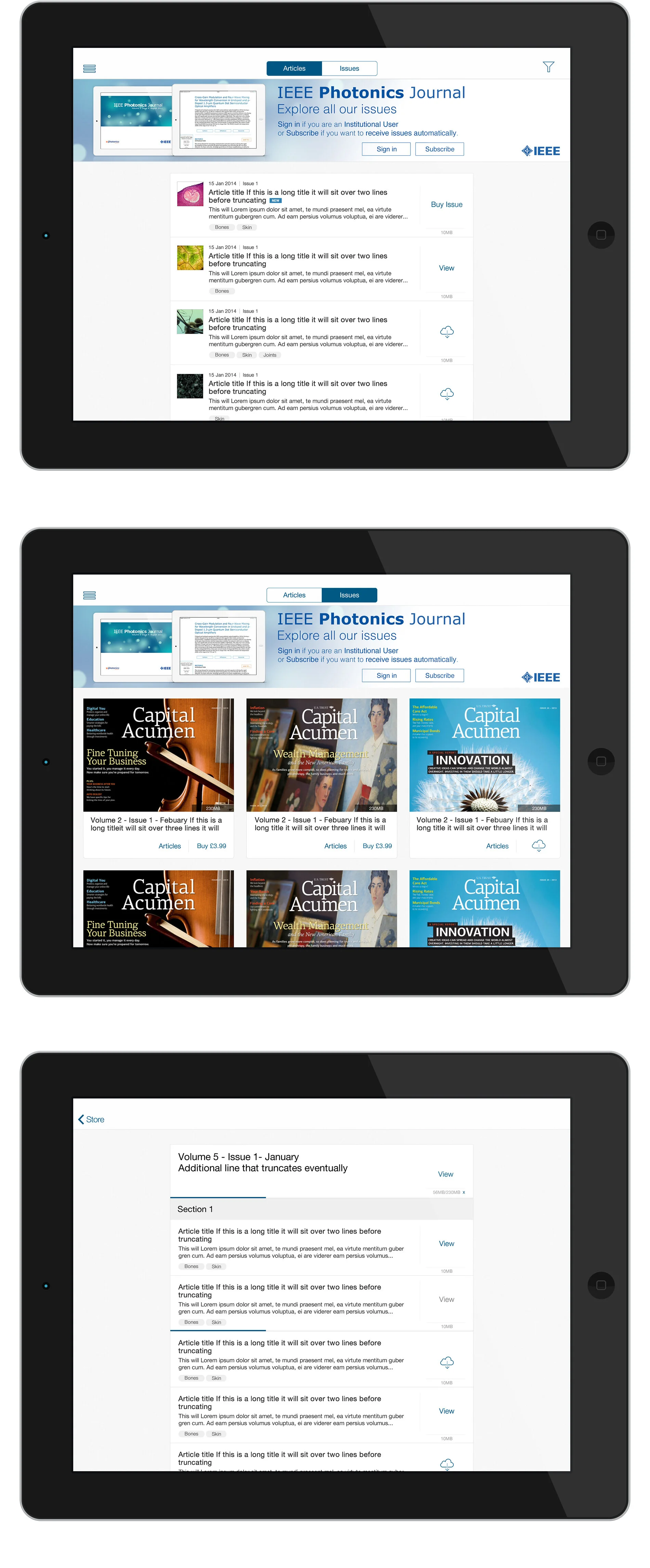
The content needed to be the focal point of the app so it was important that the UI didn't overpower the content. With that in mind we decided to work to a neutral colour pallet that would emphasis our clients content. We made the application customisable with the ability to colour particular components allowing clients more flexibility in branding the application.

The project took around 4 months to design across both operating systems.

 
02-iPad-Landscape-Flat-Mockup1.jpg
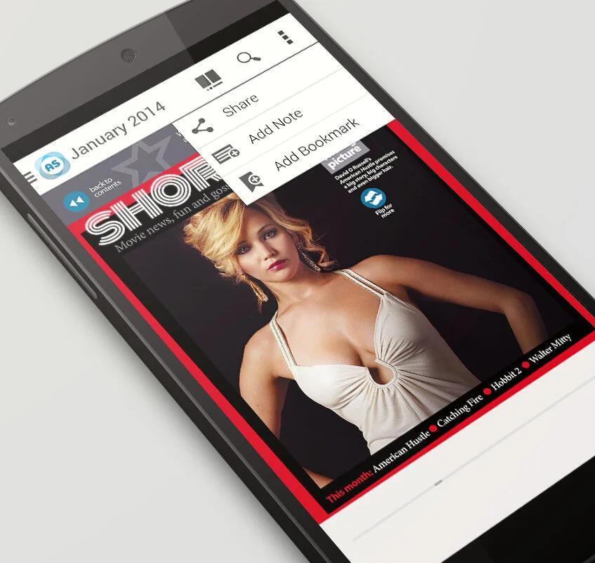
Nexus_5_Mockup2.png
nexus-5-mockup.jpg